Drop‑inVisualEditorforYourReactApp
Build with your existing React components. Let non‑developers create pages, dashboards, and layouts with a Figma‑style editor that saves to plain JSON.
UI Builder is now part of BTST — ship full-stack features faster with production-ready plugins that generate database schemas, API routes, and pages for Next.js, TanStack Start, and React Router.
Everything You Need for Visual Development
Powerful features designed to bridge the gap between designers and developers.
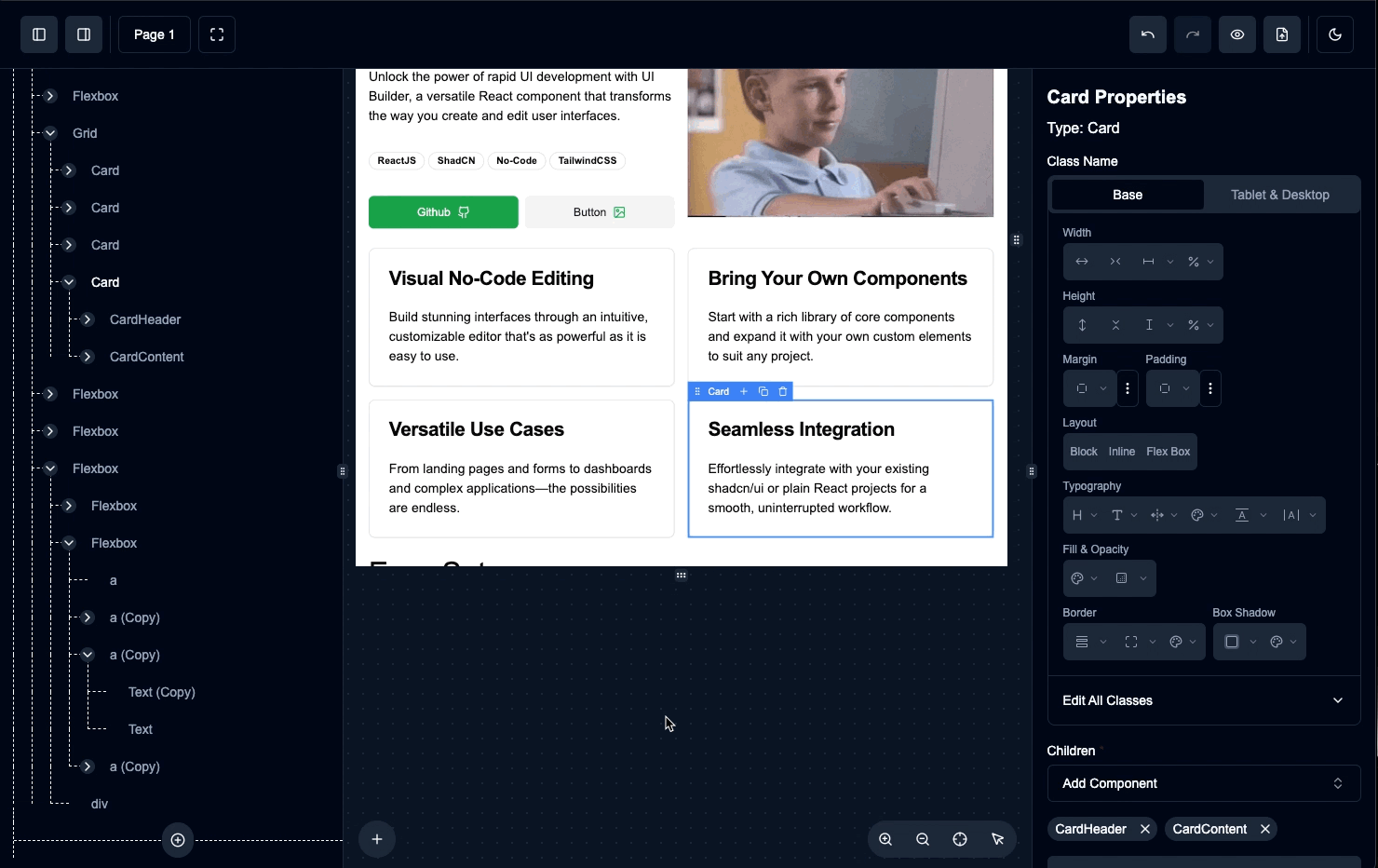
Visual Drag & Drop
Figma-style visual editor with intuitive drag and drop. Build layouts visually with real-time preview and instant feedback.
Your Components
Use your existing React component library. No need to rebuild - integrate with shadcn/ui, Chakra UI, or any component system.
Dynamic Variables
Bind component properties to variables for personalized content. Create reusable templates with dynamic data injection.
JSON Layouts
Layouts saved as plain JSON for easy versioning, storage, and rendering. Perfect for CMSs, white-label apps, and dynamic content.
Lightning Fast
Built for performance, optimized rendering, and minimal bundle size. Experience smooth interactions at any scale.
Flexible Architecture
Modular design that integrates seamlessly. Use the full editor or just the renderer - perfect for headless CMS solutions.
Built with Industry Standards
UI Builder leverages proven technologies to deliver a fast, reliable, and maintainable visual editor that integrates seamlessly with your existing React ecosystem.
All technologies are carefully selected for performance, developer experience, and long-term maintainability
Ready to Empower Your Team with Visual Development?
Join developers building the future of visual React development. Install UI Builder today and let non-developers create beautiful interfaces with your components.